Tabular Versus Visual Display of Data
An initial decision that has to be made about your data is whether it should be displayed in a table or a graph. Though there are no hard rules, there are general guidelines you can use to make this determination. Questions to ask yourself:
- Are the independent and dependent variables qualitative or quantitative?
- What is the total number of data points to be shown?
- Is there more than one independent variable?
- Are you trying to represent the statistical distribution of the data?
- How important is it to be able to see individual values?
- How important is it to understand the overall trend?
With these questions in mind, here are some examples:
Independent and dependent variables are qualitative can use a table
| Organism | Optimal Growth Condition |
|---|---|
| Streptomyces hardaur | Aerobic |
| S. huesis | Anaerobic |
| S. rainiour | Anaerobic |
| S. colorious | Aerobic |
When both your independent and dependent variables are qualitative, there will not be a suitable graph format to put it in. Symbols representing the different levels of the qualitative dependent variable can be substituted for words, however. In this example, a filled circle could represent Aerobic and a circle outline could represent Anaerobic.
Few values or data points need at most a table
| Temperature (deg C) | Mean Impact Energy (joules) |
|---|---|
| 20 | 70.4 |
| 100 | 77.3 |
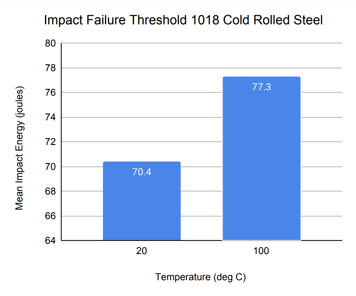
With only two values in Table 2, it does not make much sense to provide a graph since the data can be easily interpreted from the table data. The display of the exact values for each data point in Figure 1 reinforces the lack of the necessity of a graph. Two data points can also be successfully described in the main text without a table. They should be included in a table only if required by the instructor.
Four data points is enough for a table or graph
| Temperature (deg C) | Mean Impact Energy (joules) |
|---|---|
| -150 | 1.4 |
| 0 | 62.2 |
| 20 | 70.4 |
| 100 | 77.3 |
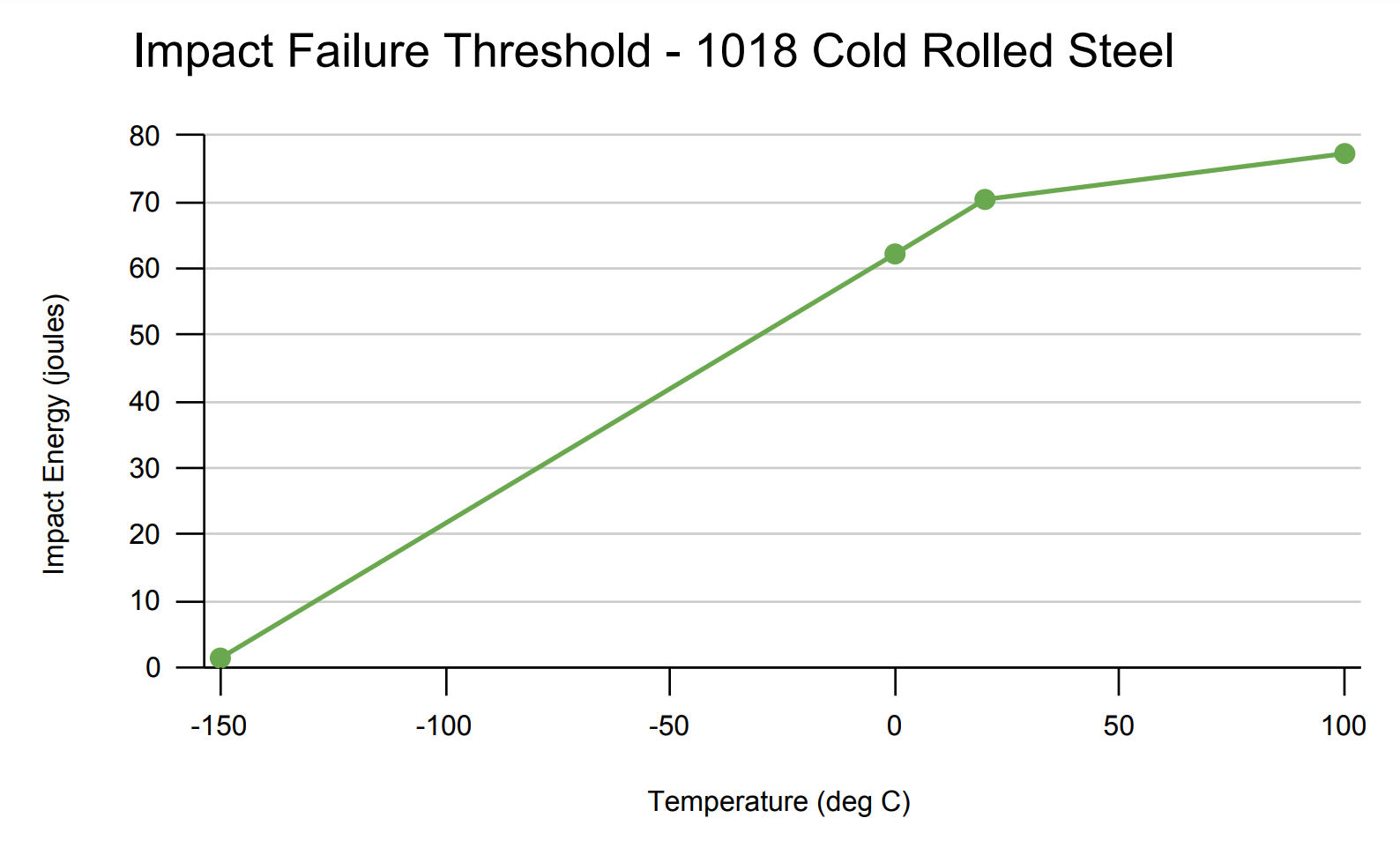
With four data points, a table for the data is usually called for. You would show these four points as a graph if it was important to show the rate of change between each pair of points (e.g., the slope of the line). Rate of change can be hard to visualize directly from numbers.
A second independent variable usually requires a graph
| Temperature (deg C) | Mean Impact Energy for Cold Rolled (joules) | Mean Impact Energy for Annealed (joules) |
|---|---|---|
| -195 | 1.4 | 0.8 |
| 0 | 62.2 | 50.5 |
| 20 | 70.4 | 202.7 |
| 100 | 77.3 | 231.0 |
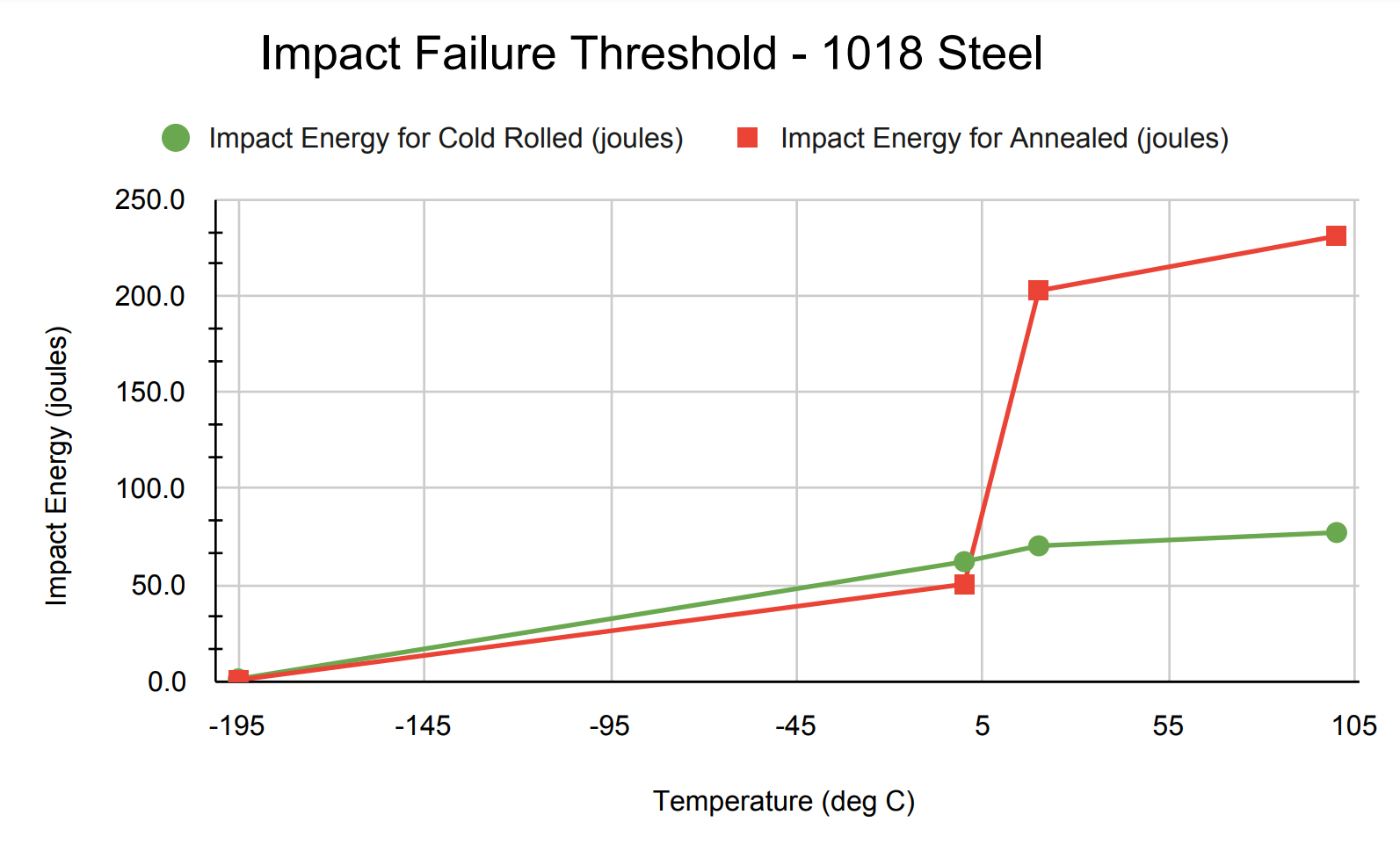
When a second independent variable is introduced (i.e., the two types of 1018 steel), a graph is usually called for in order to understand the relationship between the two sets of data.
Statistical properties usually require a graph
| Temperature (deg C) | Impact Energy (joules) Mean |
Impact Energy (joules) Standard Deviation |
|---|---|---|
| -195 | 1.4 | 0.55 |
| 0 | 62.2 | 20.79 |
| 20 | 70.4 | 14.45 |
| 100 | 77.3 | 4.32 |
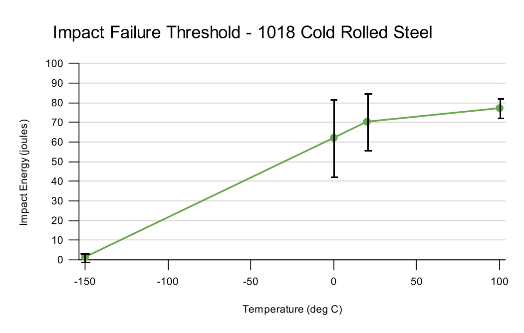
When the statistical properties of an independent variable are described, a graph is usually called for. In Figure 4, the visual representation of the error bars on the graph helps to clarify the precision of data collected at each temperature.
More than six to ten data points require a graph
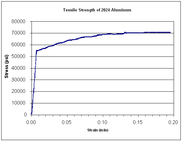
Finally, when you have over 6-10 data points, you almost always represent the data in a graph. Individuals cannot simultaneously manage more than this amount of data in memory at one time and a graph provides a compact method of synthesizing all of the data into a single image. In Figure 5, over 700 data points are summarized on the graph. If particular data values are important for your results, then these numbers can be listed on the graph, in a table, or in the main text.