Introduction
Bar graphs are a very common type of graph best suited for a qualitative independent variable. Since there is no uniform distance between levels of a qualitative variable, the discrete nature of the individual bars are well suited for this type of independent variable. Though you can extract trends between bars (e.g., they are gradually getting longer or shorter), you cannot calculate a slope from the heights of the bars.
One Independent and One Dependent Variable
Simple Bar Graph
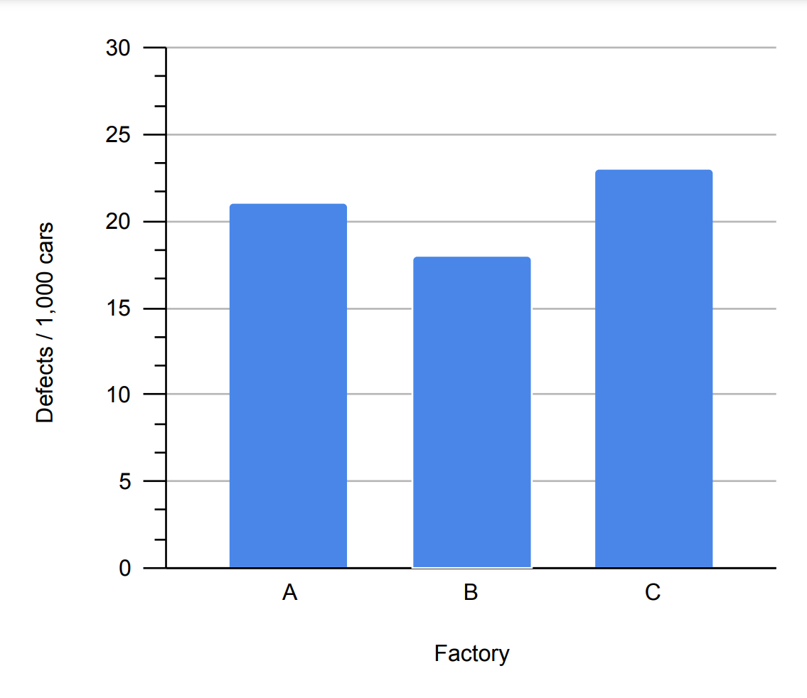
Here the Factory is our independent variable, since there is no unit of measurement for factories and no 'order' to the factories, the independent variable is nominal. The dependent variable is scalar, measured in defects/1,000 cars. Since the scalar dependent variable has a natural zero point (i.e., absolute or ratio), all of the bars are anchored to the horizontal axis, giving a common point of measurement.
Horizontal Bar Graph
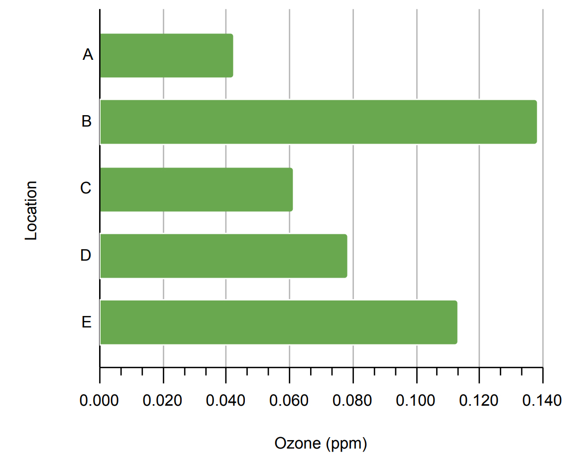
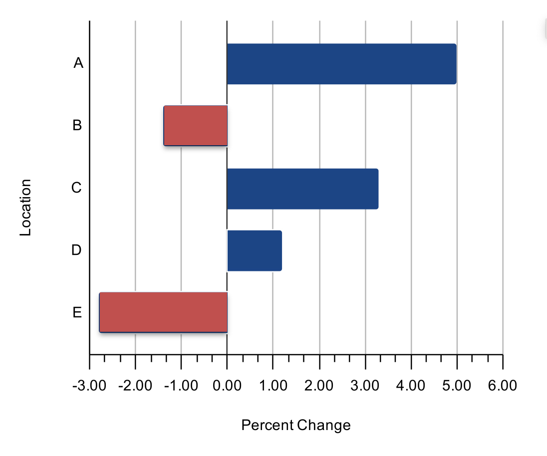
Bar graphs can be shown with the dependent variable on the horizontal scale. This type of bar graph is typically referred to as a horizontal bar graph. Otherwise the layout is similar to the vertical bar graph. Note in the example above, that when you have well-defined zero point (ratio and absolute values) and both positive and negative values, you can place your vertical (independent variable) axis at the zero value of the dependent variable scale. The negative and positive bars are clearly differentiated from each other both in terms of the direction they point and their color.
Range Bar Graph
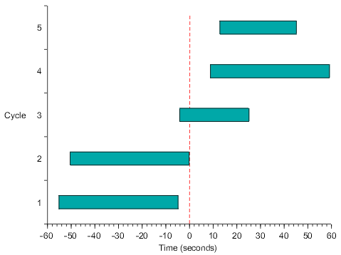
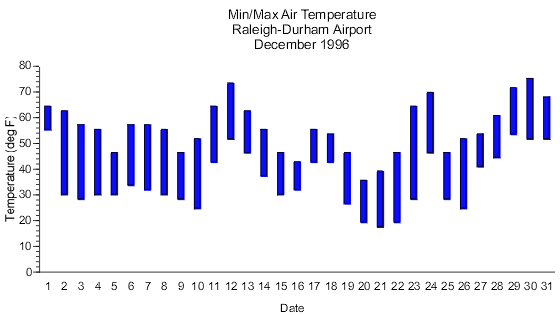
Range bar graphs represents the dependent variable as interval data. The bars rather than starting at a common zero point, begin at first dependent variable value for that particular bar. Just as with simple bar graphs, range bar graphs can be either horizontal or vertical. Notice in the horizontal example above, a reference line is used to indicate a common key dependent variable value.
Histogram
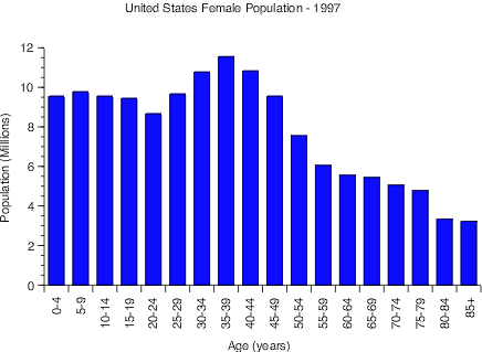
Histograms are similar to simple bar graphs except that each bar represents a range of independent variable values rather than just a single value. What makes this different from a regular bar graph is that each bar represents a summary of data rather than an independent value. For this type of graph, the dependent variable is almost always a scalar scale representing the count, or number, of how many of a sample fall within each range of the independent variable. In the example above, the sample is all the females in the U.S. The independent variable is age, which as been grouped into ranges of 5 years each. You should try and keep the ranges for each bar uniform (5 years in this case), with the exception possibly being the first and/or last range.
Two (or more) Independent and One Dependent Variable
Grouped Bar Graph
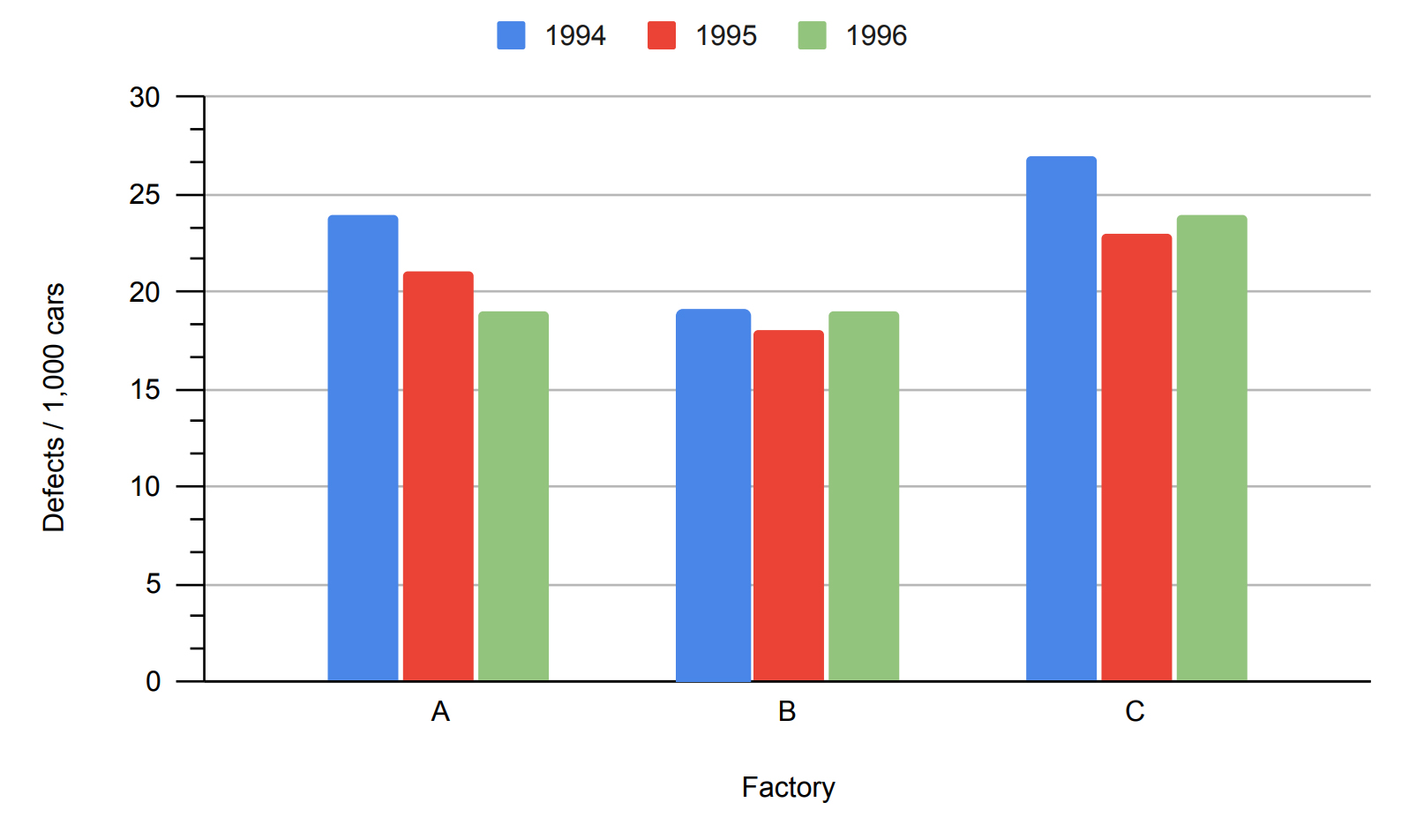
Here, we have taken the same graph seen above and added a second independent variable, year. The initial independent variable, factory, is nominal. The second independent variable, year, can be treated as being either as ordinal or scalar. This is often the case with larger units of time, such as weeks, months, and years. Since we have a second independent variable, some sort of coding is needed to indicate which level (year) each bar is. Though we could label each bar with text indicating the year, it is more efficient to use color. We will need a legend to explain the color coding scheme. Note that all of the bars for each level of factory are touching each other, indicating visually that they are grouped together.
Composite Bar Graph
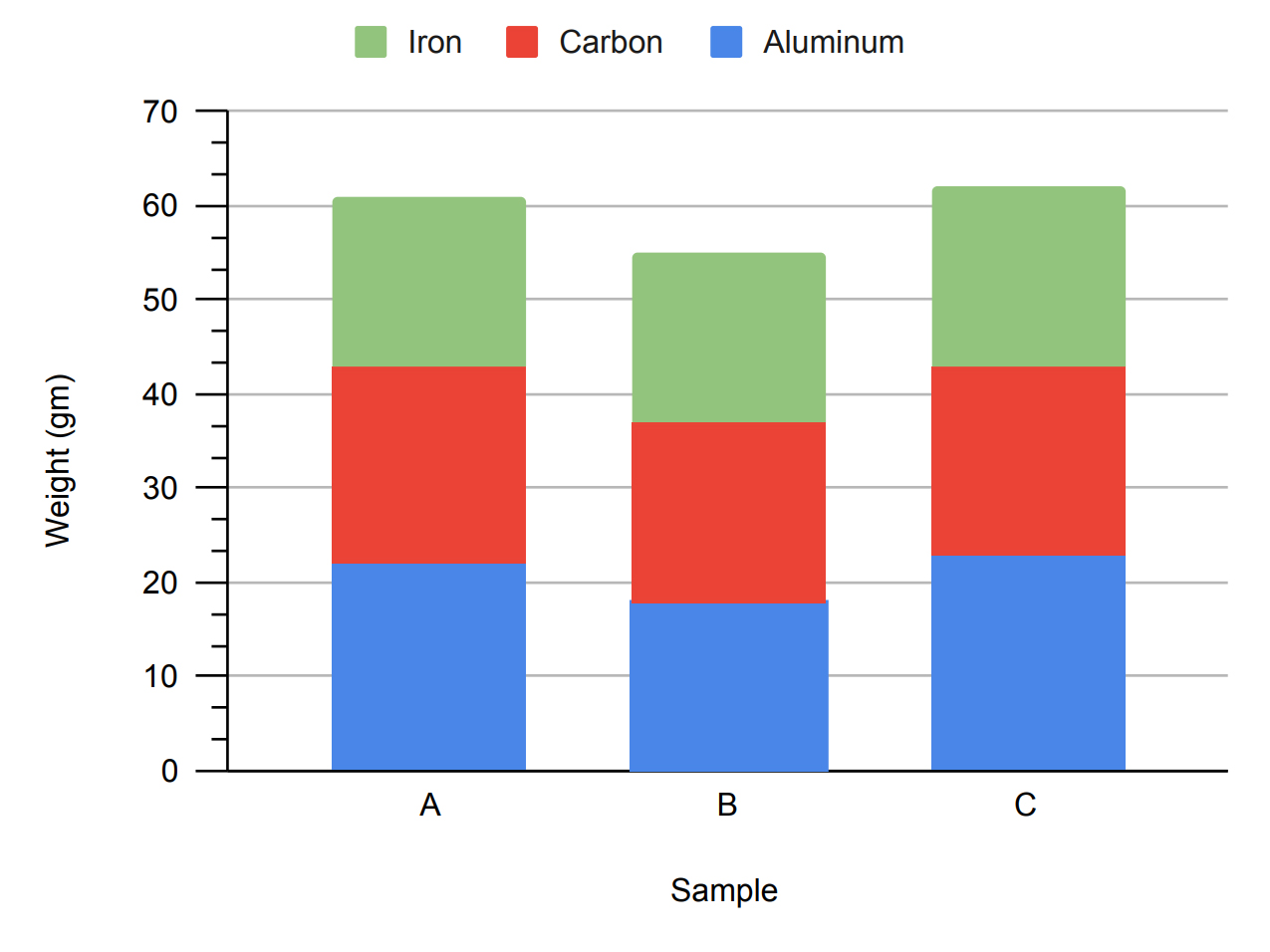
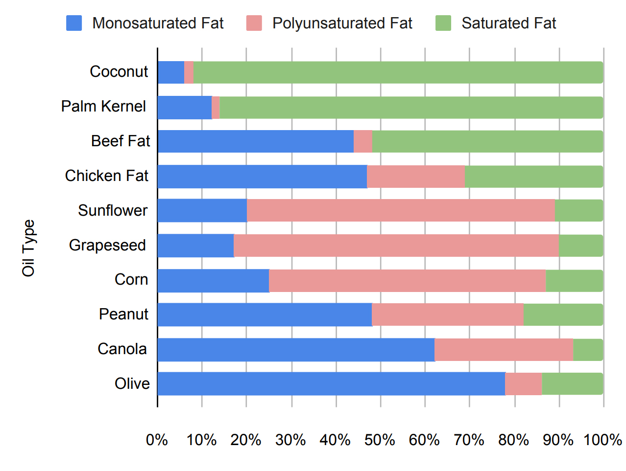
Another alternative for a bar graph with two independent variables is to have the bars stacked rather than side-by-side. This arrangement is useful when the summation of all the levels of the second independent variable is as or more important than the values for each level. In the upper example, it is very easy to read the summed weight of all of the different materials in each sample. There are, however, tradeoffs. The stacking of the bars means there is no common baseline for the individual bar elements, making it hard to make direct comparisons for the subcategories. For example, it is hard to compare the iron content of the three samples. A particularly powerful use for the composite bar graph is when the sum of all the dependent variable values for each bar is the same, such as when the values are a fraction of a whole. In the bottom example, the sum of the three different types of fats will always equal 100 percent. With this layout it is easier to see the relative portions, if not the absolute values, of a particular fat type across oils.